Forum Improvements & Changes

DataMine
by DataMine · 94 posts
8 years ago in Mafia News
Posted 8 years ago
D.M wrote:
4_6_j1mStones wrote:
i can't see the karma buttons but it might just be cause i'm new to posting
According to researching, you only see the karma buttons when you have karma. I think that might be a poor design choice so I'll see about changing it.


sounds like a plan :p
Posted 8 years ago · Author
I have made browsing the index page has more convenient. No longer do you have to scroll or see things you're not interested in.

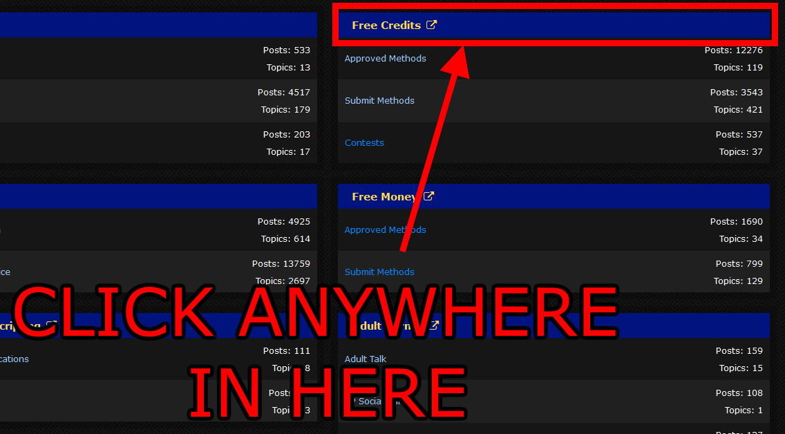
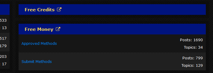
Everything on the index page is now collapsible. Simply click on the blue header above something you don't want to see (such as a sub forum) and it will collapse. Click it again to restore it.

Here's a couple images to explain what I mean:

This is where you click:
Image

And this is what happens after you click:
Image
Posted 8 years ago · Author
The market has received a cosmetic upgrade. The add/edit ad pages have been given a face lift and are hopefully more convenient and pleasant to use.
Posted 7 years ago · Author
The button that links you to a users catalog on the market has been added to the social buttons section on the bottom left of a post so you can quickly and easily access someone's shop directly from the thread.

Thanks for the idea
@Sita
Posted 7 years ago · Author
10/6/16


-User stats such as gender, post count, karma etc... have been re arranged so they look better and take up less space.

-Medals have been added to the user area on posts. So now you can see your own medals that you've been awarded and the medals other people have been awarded. As a positive side effect you can now also see who's staff by checking to see if they have the staff badge.
Posted 7 years ago
Wow.. Everithings A-M-A-Z-I-N-G-!


Thank you for changing login way as well, I didn't login by cell before.
Posted 7 years ago · Author
Here some recent changes made to the forums part of the site over the last 2 weeks:


The post new topic and reply buttons have been given an icon to better indicate their purpose to users.

The smiley system has been given an update: viewtopic.php?f=3&t=11068

Tweaked the color of the primary buttons and added hover/active states to better communicate to the user that they are clickable and reacting to clicks.

Modified the folder icon on the index page forum listing to better inform the user that they are looking at a forum with sub forums inside it.

Fixed user's market button in posts. It now actually links to an individual's ads on our Gray Market.

Added borders to the left and right of the topic view and reply counts on the viewforum pages to better separate the information and make it easier for user's eyes to quickly glance at it.

The previous and next buttons in the pagination control on the viewtopic and viewforum pages have had their text replace with web font arrows. This reduces wasted space and should hopefully look more better

Create an account or sign in to comment

You need to be a member in order to leave a comment

Sign in

Already have an account? Sign in here

SIGN IN NOW

Create an account

Sign up for a new account in our community. It's easy!

REGISTER A NEW ACCOUNT